What's New in Website Design for 2016
posted on
Web design is a fast-moving field, and this year's new design trends, best-practices and technology advances will create an online landscape so visually modern that even the least savvy visitor will stand up and take notice. Here's what you'll see if you decide to give your site a fresh look for 2016.
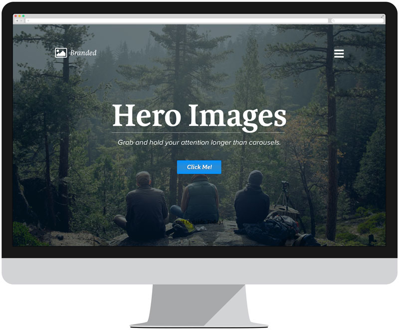
Carousels Are For Horses
Slow down there, cowboy. If you want to deliver a message to someone, let them look at it. Sliders can be useful for sites that have a lot of information to convey, but if you want maximum impact, choose a strong, clear message, put it front and center, and let it ride. Looking to add that little extra something to your hero photo? Consider the cinemagraph. Basically a photo with a little bit of movement, cinemagraphs hold users’ interest longer than static photos, use less bandwidth than videos, and look wicked cool.
Escape from Flatland
Flat design’s not going anywhere, but it might be poised to enter a new dimension. Classic, minimalist design will probably still prevail, but designers are using depth effects like shadows and edges, responsive animations and other concepts to create a more realistic look.
Typographyapalooza
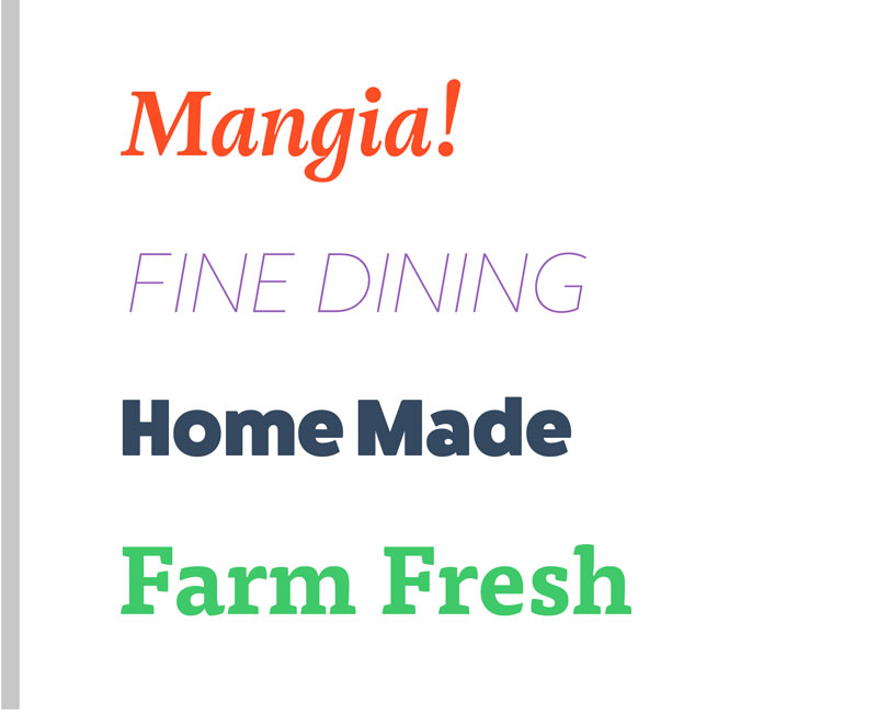
Now that web fonts are accessible to everyone, expect an explosion of different type treatments. No more default fonts—we’ll see fonts chosen more carefully to reflect the personality and brand of the website, with lots of variation in color, weight and size.
Color Me Colorful
Speaking of color, 2016 will see a lot of it. No more muted looks—websites born (or reborn) in 2016 will see more vibrant colors, color blocking, and bright colors used in hover states and card-style designs.
Scroll Till the Cows Come Home
It used to be conventional website wisdom that everything important had to be above the fold. No longer. As mobile users become increasingly accustomed to scrolling endlessly down a page to find what they’re looking for, you can now feel free to take visitors on a storytelling journey through your site, using section breaks to create the experience of multiple pages without ever leaving home.
Be Yourself: Everyone Else is Taken
Ever visited a website for the first time and thought to yourself, hmmm, this looks verrrry familiar? Having a uniform user interface has its benefits (familiar feel, easy navigation), but experts say this year could bring a resurgence of originality, with a movement away from stock photos of beautiful people thoughtfully consulting toward more original illustrations and animations, which offer a more relatable experience for users and a more individualized way of expressing a website’s identity. Choosing originality might not be the easiest route, but the additional investment will make your website stand out from the crowd.