
 At Exposure, our branding experts create logos that do more than identify an organization—they build recognition, stand out from competitors, and create lasting connections with their target audiences.
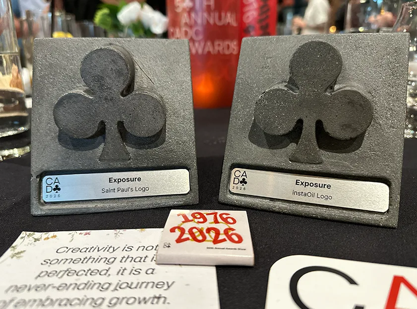
That’s why we’re proud to announce two Silver Awards for Logo Design at the 50th Annual Connecticut Art Directors Club (CADC) Awards, held on July 25, 2026, recognizing our work for Saint Paul’s Episcopal Church and InstaOil.
These award-winning identities represent two very different organizations, but each demonstrates how thoughtful design can communicate purpose, strengthen brand recognition, and provide a strong foundation for future growth.
CADC Silver: Saint Paul’s Episcopal Church of Willimantic
Category: Trademark/Logo Identity
 When Saint Paul’s Episcopal Church of Willimantic partnered with Exposure, they were looking for more than a new logo. Their existing identity centered on an illustration of the church building, but they wanted a brand that better reflected their welcoming congregation, community outreach, and progressive mission.
The rebrand also coincided with an important moment in the church’s history. As the parish prepared for the retirement of its longtime minister and the search for new leadership, the updated identity and accompanying website would help introduce Saint Paul’s to prospective parishioners and their incoming minister.
Exposure developed a bold, modern mark centered around a radiant star, with colorful rays representing the diversity of the congregation and the surrounding community. A halo connects the rays while a cross of light emerges from the center, symbolizing people united through faith. The result is a vibrant, contemporary identity that reflects the church’s inclusive spirit and its commitment to serving the community.
CADC Silver: InstaOil
Category: Trademark/Logo Identity
 InstaOil is a new on-demand home heating oil service designed to make purchasing oil faster, simpler, and more transparent. From the beginning, the goal was to create a memorable brand that was easy to recognize, easy to pronounce, and strong enough to stand out everywhere—from a mobile app to the side of a delivery truck.
Exposure created a bold, minimal identity that pairs a clean, highly legible wordmark with a distinctive red flame inspired by the pilot light found in home heating systems. The flame represents dependable home heating, while the black typography reflects the essence of oil itself, creating a mark that is both modern and instantly recognizable.
The new identity extends to a companion marketing website that introduces the upcoming InstaOil app, explains how the service works, and highlights its simple approach to ordering heating oil with transparent pricing, no contracts, and no hidden fees.
Since 1996, Exposure has helped organizations of all sizes develop brands that are both meaningful and memorable. We’re honored to have this work recognized by the Connecticut Art Directors Club and grateful to our clients for trusting us to bring their stories to life.