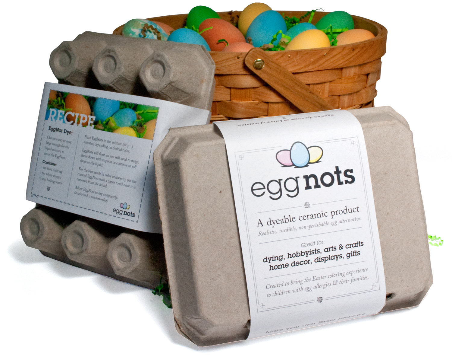
A dyeable ceramic egg alternative created to bring the Easter coloring experience to children & families affected by egg allergies, as well as vegan households.
CADC Silver: Packaging Design
CADC Excellence: Logo Design
CADC Excellence: Website Design
American Graphic Design Award: Website Design
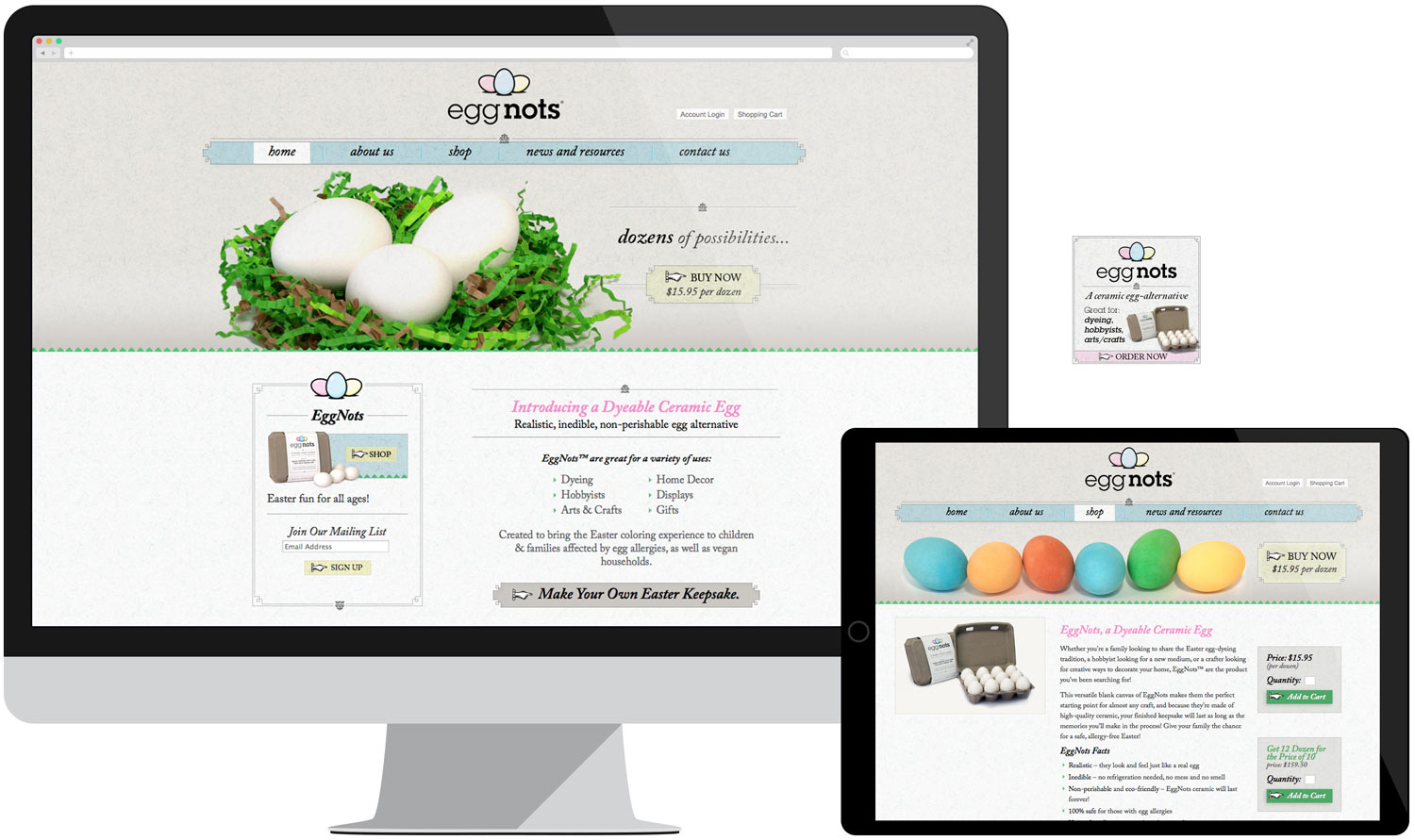
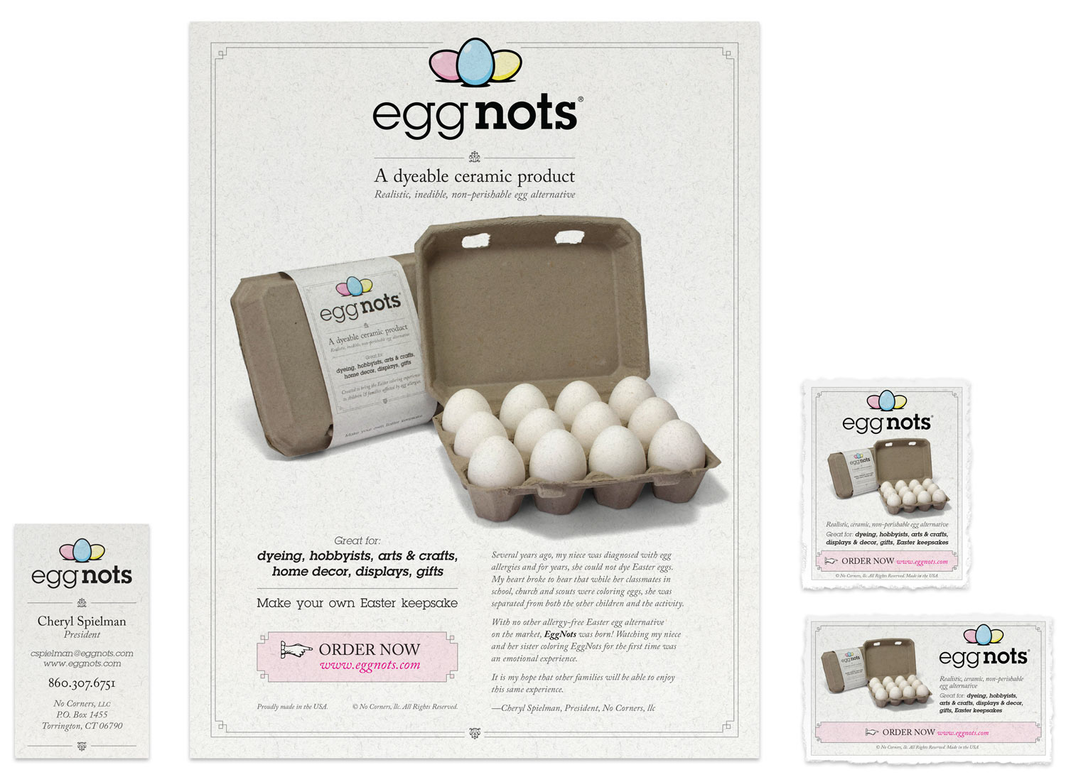
Logo Development: The informal positioning of the trio of eggs feels fun and inviting, speaking to the family-oriented activity. Using straight screens of cyan, magenta and yellow for each egg hint at the opportunities for dying and provide a reliable way to reproduce color in digital and offset applications.Packaging: An earthy, natural-looking belly-band around a uniquely shaped egg carton accentuates the eco-friendly brand’s simplicity while helping to make the product even more kid-friendly.Website: With a clean layout, textured backgrounds, and bright, eye-catching photography, the EggNots website manages to be both fun and soothing. The site’s simplicity puts the product in the spotlight, encouraging visitors to unleash their own creativity.Print Collateral: Business cards and a sell sheet are printed on the same flecked paper as the belly-band, and for the print ads, the textured paper was scanned in and printed with the ad to carry through the brand’s earthy, natural look.