The Substance Exposed Pregnancy Initiative of Connecticut (SEPI-CT)
This state initiative raises awareness about substance exposure during pregnancy, while helping families access the treatment, recovery, and support resources they need.
Branding
A hallmark of SEPI’s work is its inclusive nature, encompassing families of all types, so their bold yet simple branding conveys warmth and comfort. The logo is representative of a pregnant person in the shape of a semicolon, which symbolizes hope and the choice to keep going and seek help in the face of addiction.
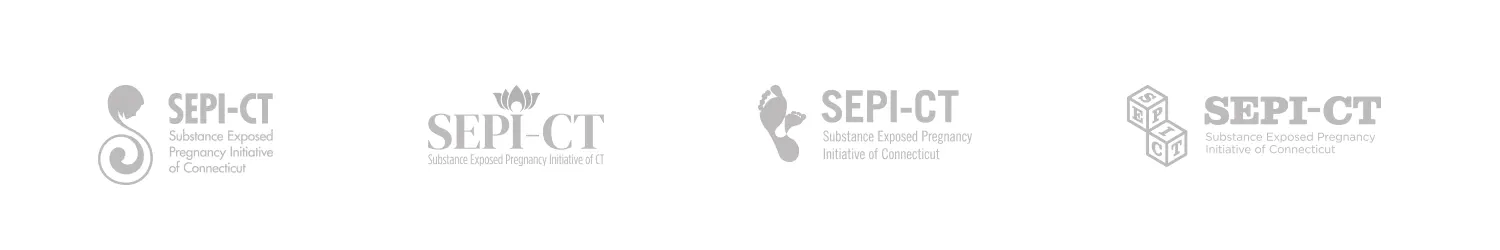
Alternate Logo Concepts
We explored several logo concepts that could visually represent SEPI’s work, with each option centering the parent-child bond. During later color explorations, purple and turquoise were selected to represent addiction recovery.
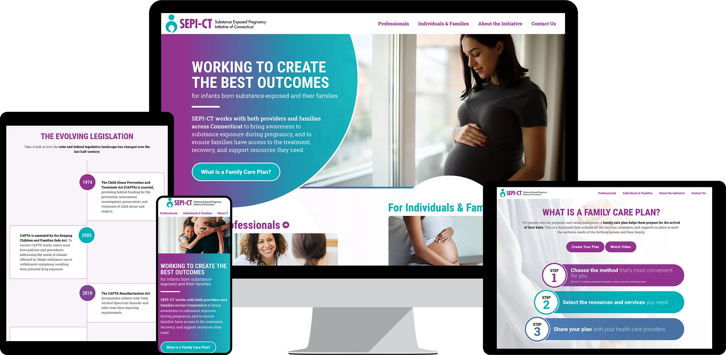
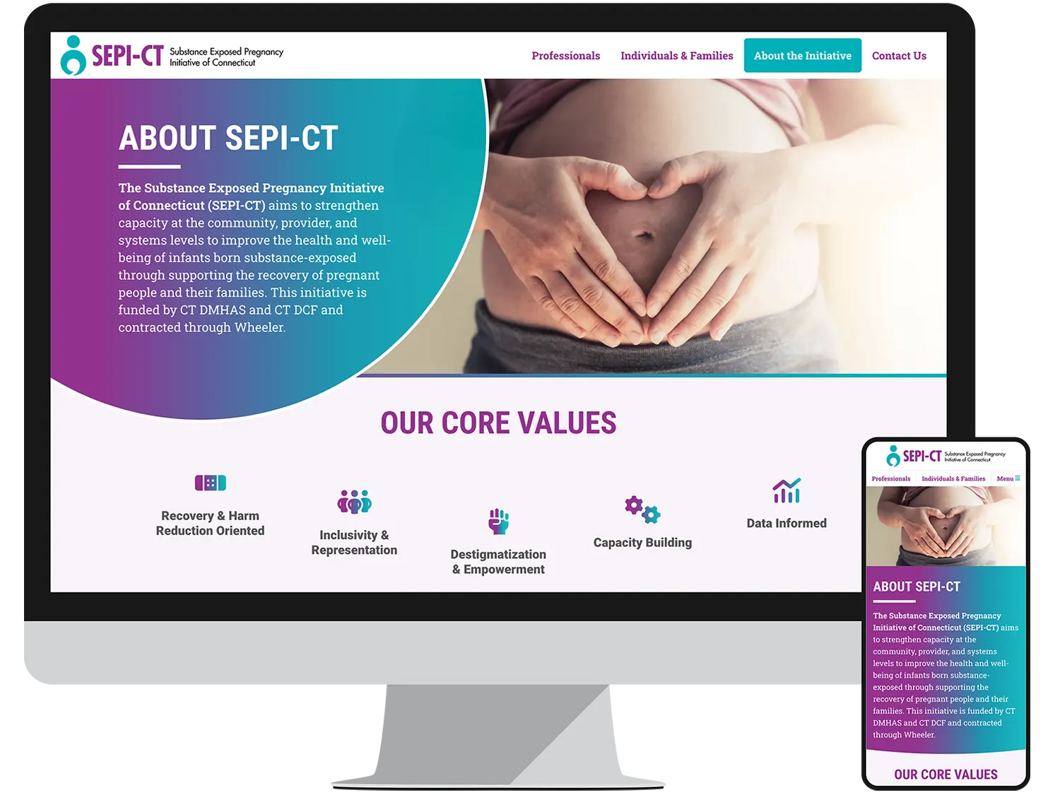
Website www.sepict.org
SEPI-CT’s web presence was developed as an extension of their work to raise awareness about resources available for those struggling with drugs or alcohol during pregnancy. With a welcoming design, simple navigation, and inclusive imagery, the site puts visitors at ease while connecting them with the information they need.
Landing Pages
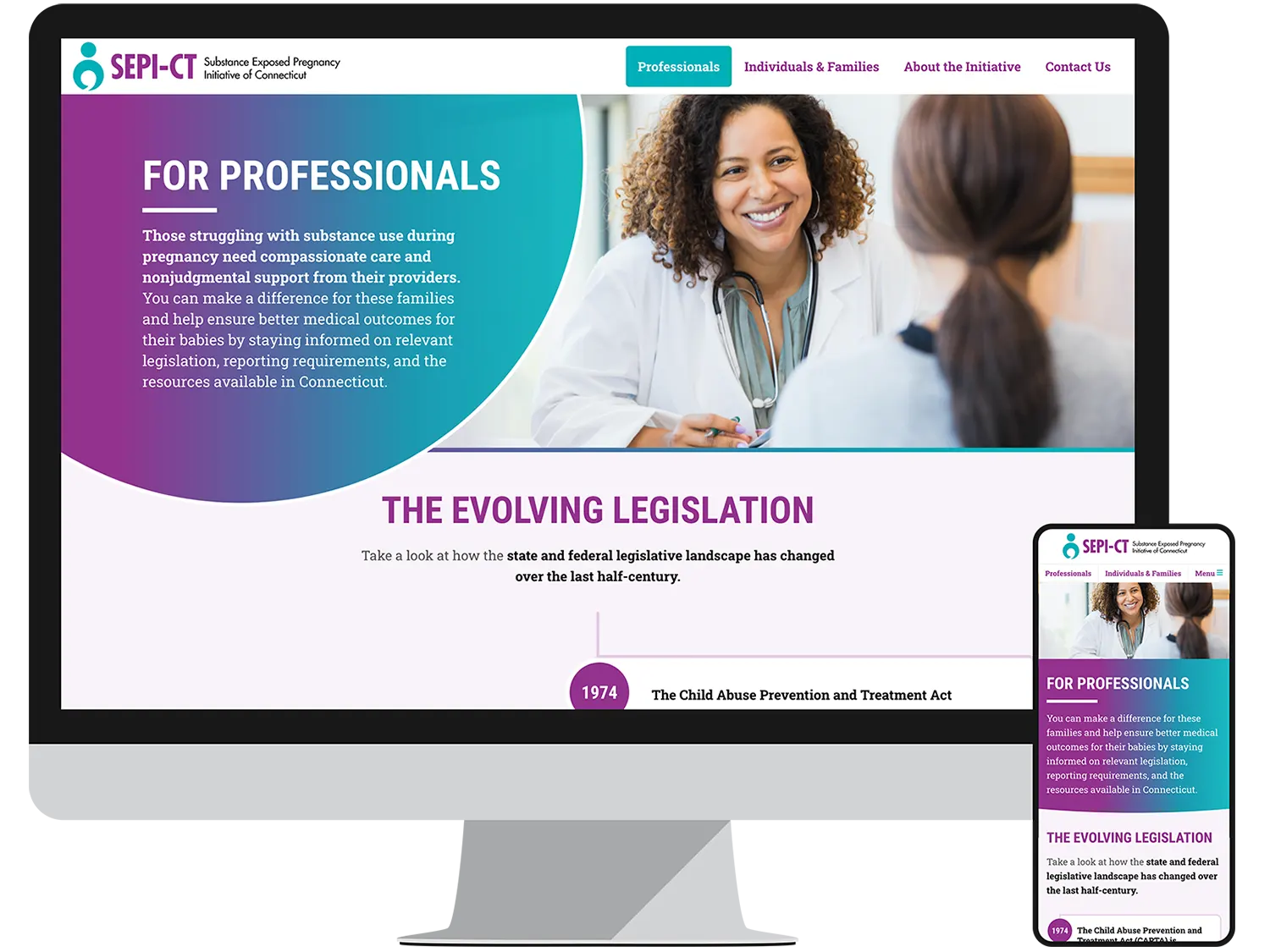
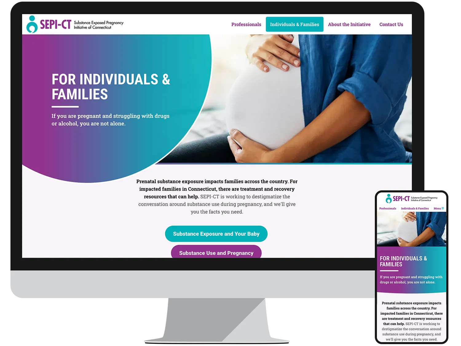
To keep complex information accessible, we created two dedicated landing pages for SEPI-CT’s primary audiences, as well as a third one that introduces visitors to the organization. The Professionals page offers a legislative timeline and access to provider resources, while the Individuals & Families page provides simple and direct entry points to information and support.
“Working with Exposure was a very smooth process. They really nailed the website—it’s exactly what our vision was, they really brought it to life.”