The Buckingham Routh Co.
The oldest mechanical contractor in the United States, Buckingham Routh has provided commercial plumbing and HVAC design, installation, and service since 1854.


Branding
Buckingham Routh wanted to refresh their logo without losing the 170 years of brand equity behind their name. To keep the company’s impressive history front and center, Exposure selected a font inspired by commercial lettering of the 1920s and 1930s for Art Deco undertones. The addition of bold colors and clean lines gave the logo a strong, modern feel.

Alternate Logo Concepts
The Exposure team explored a variety of directions for the logo concept.

Website www.buckinghamrouth.com
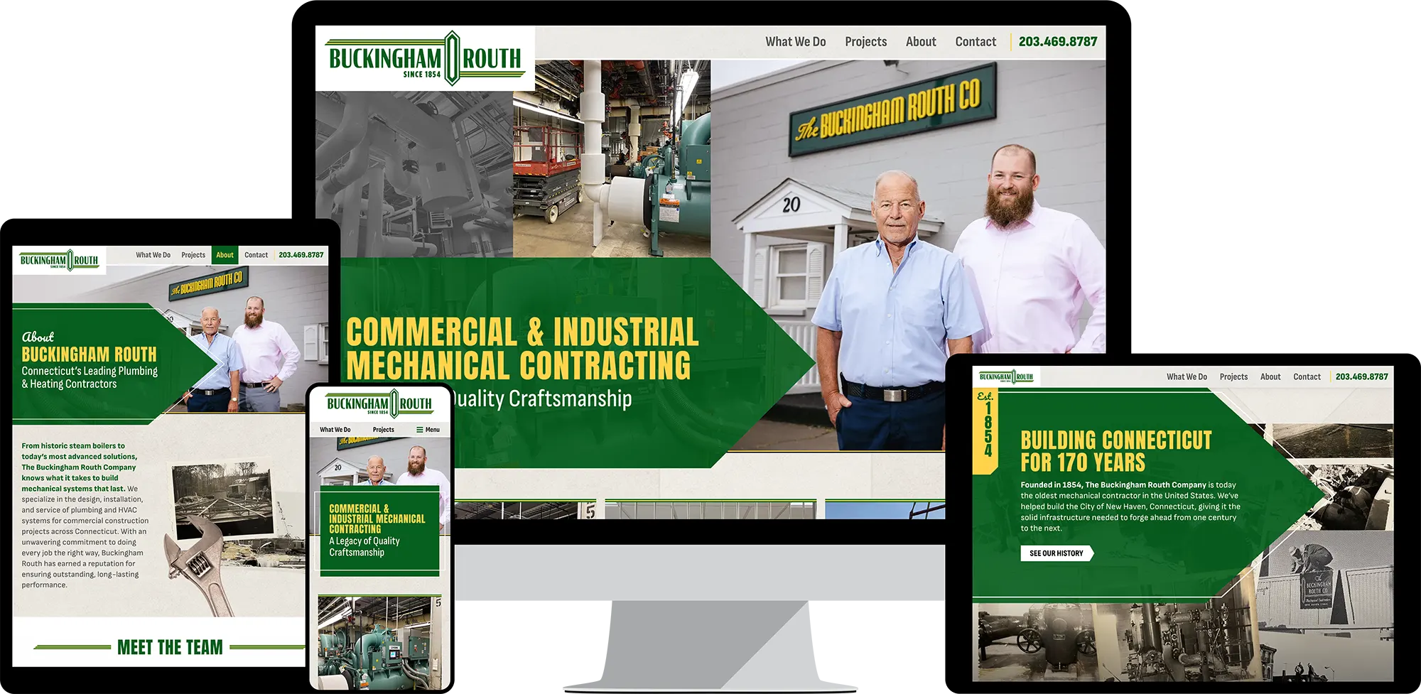
The new website design is clean, professional, and engaging, with images from the company’s history as well as up-to-date photos from their recent projects. Built on the WordPress CMS, its content can be easily maintained as the company’s legacy continues.

Calendar
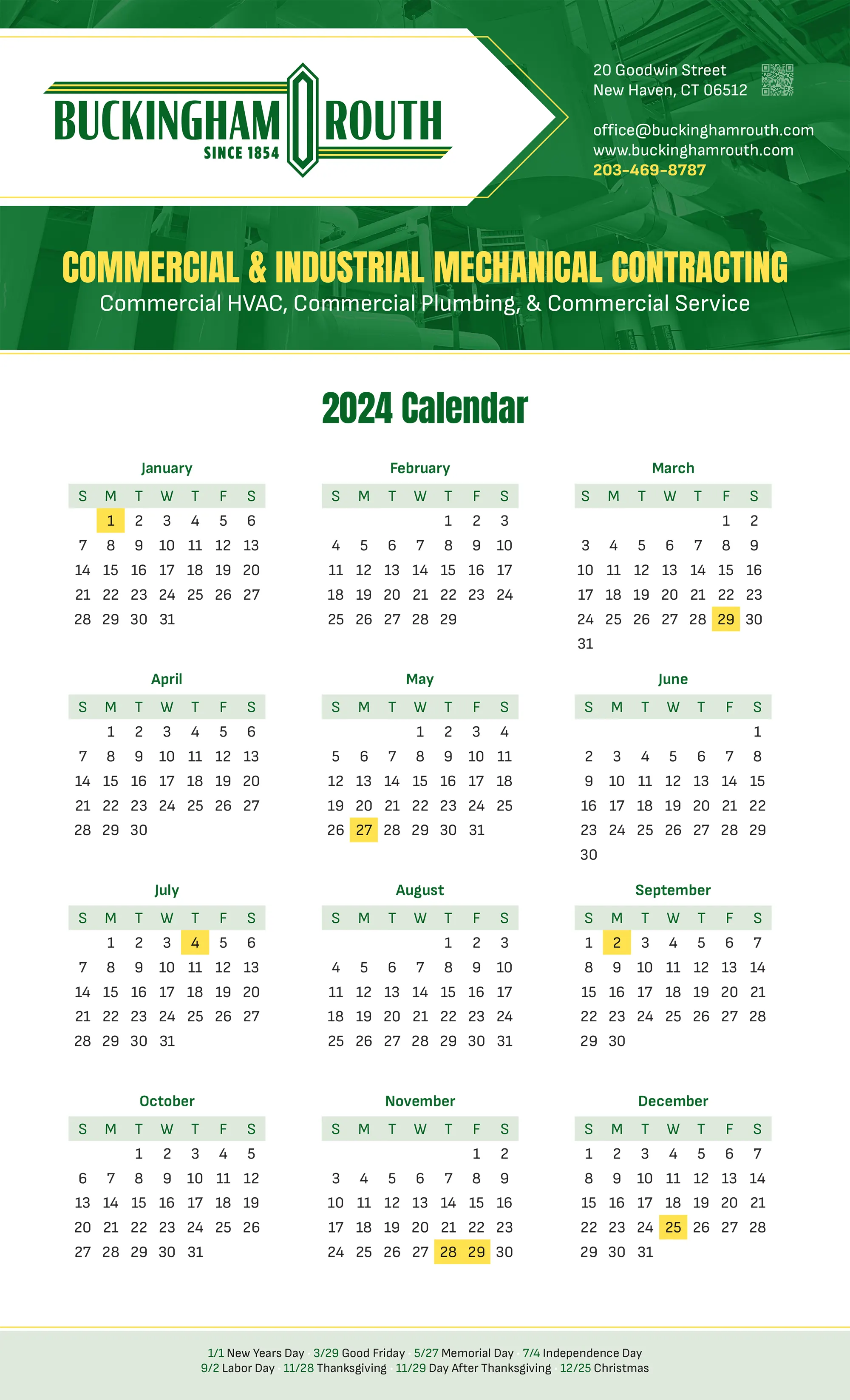
As a promotional piece given out to Buckingham Routh clients, Exposure designed this 2024 at-a-glance calendar, with the company’s holiday closings highlighted for convenience.
