Website Don’ts That Are Killing Your Business

Not quite ready for a full website redesign but want to make a few tweaks that will still yield results? Here are some common mistakes you might be making on your website, and how to fix them.
Not stating who you are and what you do
Don’t imagine your customers know you or that the imagery on your website makes it clear. Your home page should have a short, clear statement explaining what your company does. Avoid being vague or poetic and make sure clever taglines don't overpower that clear messaging. If it takes a site visitor more than a couple seconds to figure out what you do, they will leave. To complement your welcome message, be sure to have a robust About Us page.
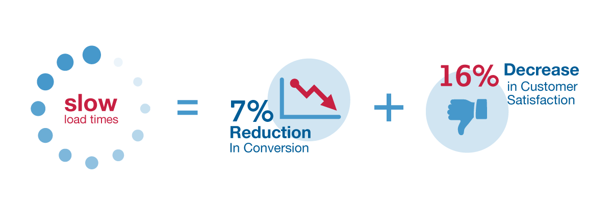
Slow load times
According to the Aberdeen Group, a one-second delay in load time can result in a 7% reduction in conversions and a 16% decrease in customer satisfaction. 47% of consumers expect a site to load in two seconds or less. If your site doesn’t meet that benchmark, not only will you drive customers away, you’ll be penalized by Google in search rankings.
In Google’s Site Performance for Webmasters video, tech lead Maile Oye said “two seconds is the threshold for e-commerce website acceptability. At Google, we aim for under half a second.”
Web page elements such as scripts, stylesheets, oversized images, Flash animations, and native videos can all bog down your site’s performance. Check the page speed of your site with a free tool such as GTmetrix, Pingdom, or WebPageTest, which also provide optimization suggestions if your results are subpar.
Poor readability and scanability
A website can be difficult to read for many reasons: a cluttered design, poor color choices, or too-small fonts. Make sure your website uses colors that complement each other but still provide contrast, fonts that are readable and not too small (at Web Solutions, our standard for website body copy is 16 points), and a clean design with plenty of white space.
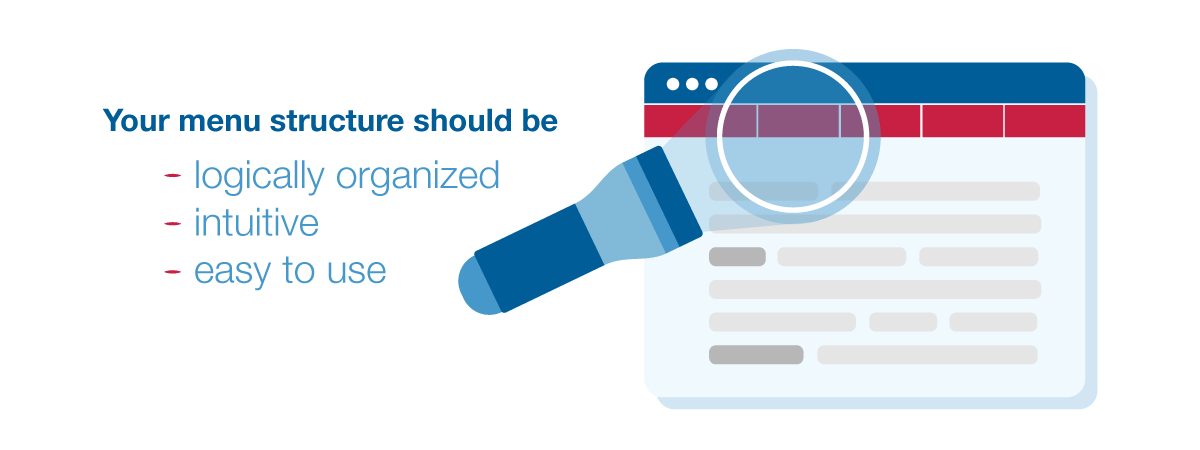
Unclear navigation
If site visitors can’t quickly find what they’re looking for, they’ll give up. Avoid losing them by creating a menu structure that is logically organized, intuitive, easy to use, and designed around the needs of your site visitors. (If you’re not sure what those needs are, use your personas or consult with your sales and customer service teams.)
Try to keep top menu items to less than seven, and make sure the most-visited pages can be easily found (check Google Analytics to see which pages are most popular). Don’t get too creative—put things where they usually go (like Contact in the top right corner and company address in the footer), and always include a sitemap.
No engaging content
Having content that provides real value to your readers not only helps you earn the trust and loyalty of your existing clients and convert prospects into customers, it also helps boost your site rankings. Focus on providing engaging, interesting, well-written content that helps your site visitors solve their problems. (Need content tips? Read our blog post on How to Be a Great Content Marketer.)
No calls to action.
Your clients may be ready to convert, but they can’t buy, learn more, sign up, or take whatever action you want them to take unless you ask them to. Want to create super-effective calls to action? Check out or blog post on 4 Simple Steps to Improve Your Calls to Action.)
Without reinventing your web presence, you can refresh your site with an emphasis on these six key factors.