Simple Steps to Improve Your Calls to Action

Every great website has one thing in common: It drives visitors to take an immediate action toward the services or products being offered.
User experience, great design, and strong content can all contribute to this goal, but the most powerful way to get visitors to take the next step is a well-strategized call to action (CTA).
A call to action asks the user to take the next step toward a conversion. These can include:
- Request a demo
- Get an estimate
- Subscribe
- Make an appointment
- Submit a contact form
- Purchase something
Getting a user to take this step requires that you understand:
- Your goals for each web page
- The wants and needs of your audience
- The creative elements that will inspire your audience to act
Here are the four steps you can take to create CTAs that get results.
-
Define Your Call To Action Goals and Opportunities

Every page of your website should have a call to action. Sometimes, deciding on a CTA is easy—if the overall goal of your website is to get visitors to request a demo, your CTA should probably be Request a Demo.
But to ensure effectiveness, you should dive deeper into the decision phase of the buyer’s journey. Look at each page on your site and think about the people who might be visiting:
- Have they read enough about your products and services to make a purchase decision, or do they need additional information first? (e.g., download a spec sheet)
- What might they want to do next?
- Does it make sense to have multiple CTAs on this page—e.g., one for a user seeking more information and one who is ready to talk to a sales rep?
-
Get Your Call To Action Noticed
Placement and design can be the difference between a CTA that gets clicks and one that goes unnoticed.
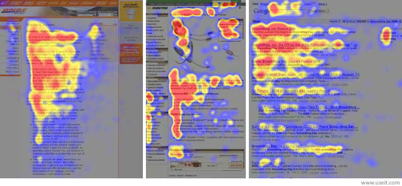
www.nngroup.com Placement: Website visitors tend to scan pages in an “F” shape—meaning a call-to-action toward the top or middle-left of the page might be worth considering.
While the bottom of a page is an easy place to ask a user to take the next step, in some cases users won’t actually read all the way to the bottom, so think carefully about the most strategic placement of your CTA.
Design: Don’t underestimate the power of design. A sophisticated, brand-consistent call to action builds trust with the user. Good CTAs typically have similar elements:
- They use contrasting colors that attract attention but still work with the page's overall design
- They are set off from the body of the text and surrounded by enough white space to make them easy to see
-
Get Users To Click Your Call To Action
Placement and design are important, but even more crucial is using the right messaging. What your CTA says is the last test you must pass in order to get the coveted click from your user.
While it might be tempting to get creative with your CTA, it's better to use straightforward messaging to help users understand the exact next action they must take to continue their journey.
The formula is simple: start with an action word that represents the next step (request, register, download), and take it further by denoting the value in that action. Instead of the boring “Submit,” try the following:

-
Test Your CTAs
Once your calls to action are in place, check to make sure they're doing what you want them do. You can do this by:
- Tracking conversions or events in Google Analytics
- Installing heat map tracking to see how people are interacting with the CTAs
- Do A/B testing for placement, design, and messaging to determine what's most effective with your audience