How to Design a Website That Converts

Conversions are crucial to your business, because without conversions, you have no customers.
Turning a website visit into a conversion means getting a potential customer to perform a desired action such as making a purchase or subscribing to an email list.
There are many ways to improve online conversion rates, including A/B testing, customer surveys, and usability testing, but one of the most effective is to improve the design of your website.
Try these 10 web design tips to improve your website conversion rate.
1. Design for User Experience (UX)
If your visitors have a good experience on your website, they're more likely to trust your brand and become customers. According to a study by Stanford University, website design is the most important factor users rely on to determine if your website is credible or not, and according to Forrester Research, good UX design can increase your website's conversion rate by up to 400%.
2. Choose the Right Colors
Color choice has always been an important part of marketing and product packaging, and many studies have shown a close correlation between color and purchasing decisions. According to a study by the Institute for Color Research, between 62% and 90% of the initial assessment people make about an environment or product is based on color alone, and according to research by Kissmetrics, 52% of web users say they won’t return to a site if they find the colors and overall aesthetics unappealing. When designing your website, choose attractive color combinations that fit with your brand image and evoke the mood you want your customers to experience when they visit your site.
3. Optimize for Mobile Users
Up to 70% of website traffic comes from mobile devices, so it’s important to create a good experience for mobile users. For better mobile conversion rates, make sure your website offers a responsive layout, simple forms, and call-to-action buttons that are highly visible and easy to click with a finger.
4. Understand the F Pattern
Studies show that users look at a website in an F pattern, starting at the top left corner and reading straight across to the top right corner, then moving their eyes down to the middle line of the letter F and moving across. Since the top left corner of a web page is the first place the user’s eye goes, make sure that quadrant is making a good first impression, both design-wise and with key information and conversion points.
5. Follow the Rule of Thirds
The rule of thirds is a design principle that has carried over from the print world into web design, and is used to determine the best areas on the page to place key content based on where the user’s eye is naturally drawn. If you mentally draw a tic-tac-toe grid on your web page, which divides the page into thirds both horizontally and vertically, the four corners of the center square are the best locations for important content like headers and calls to action.
6. Make Good Use of White Space
White space, or negative space, is the space around the images, type, and other graphical elements on your website. Don’t make the mistake of trying to fill up all that “blank” space! Using too little white space in your website design makes web pages look cluttered and makes it difficult for users to find the information they need to make a conversion.
7. Make Navigation Easy
The best way to get a site visitor to take action is to guide them toward that action. Creating an easy to use, intuitive navigation on your site will not only help them find what they’re looking for, it will get them where you want them to go with the fewest possible number of clicks.
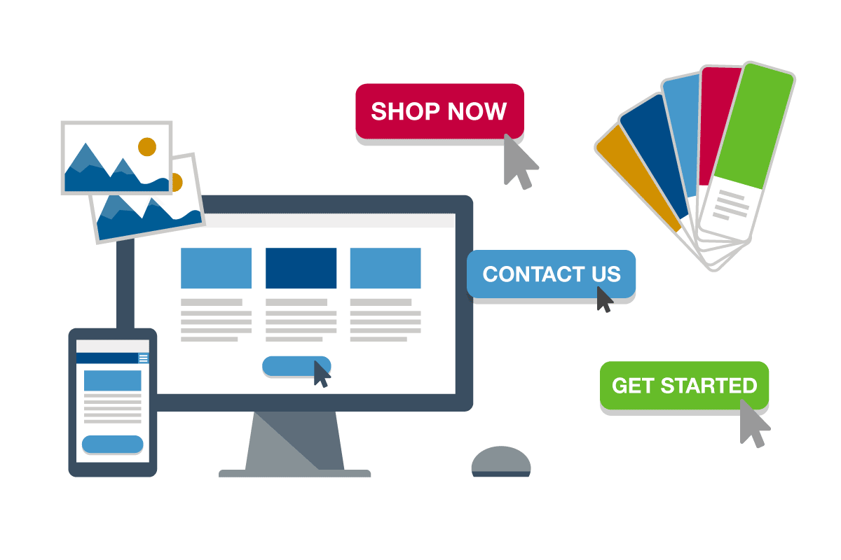
8. Create Strong CTA Buttons
Call-to-action (CTA) buttons are what the user clicks in order to initiation a conversion, so the better your CTA buttons are, the better your conversion rate will be. Studies show CTA buttons that are red, orange, or green get the highest conversion rates, as long as they stand out on the page. For more information, see our blog post 4 Simple Steps to Improve Your Calls To Action.
9. Use Images to Offer Directional Cues
If there’s somewhere specific on your website that you want users to go, use images to give them a nudge in the right direction. Using a photo? Try one with a person subtly pointing or looking toward the place on the page you want your visitors to go next, like a button or CTA. If none of the images on the page lend themselves to directional cues, consider using an arrow to point to the CTA.
10. Minimize Choices
Studies have shown that the more options you give someone, the longer they will take to make a decision. In web design, you can increase your conversion rate by limiting the number of choices a user has. If you have a primary desired action you want your site visitors to take, give them a clear path to that action, don’t offer a list of options.