Website Navigation Tips to Give Your Website Visitors an Excellent User Experience

The navigation of your website—how site visitors move around the site—makes a huge difference in user experience.
If your website has a clear, intuitive navigation that makes it easy for visitors to browse through the site, find what they’re looking for, and fulfill their goals on the site, you’re offering them an excellent user experience that will likely lead to lower bounce rates, more conversions, and higher levels of satisfaction with your website and your brand.
If your website navigation is confusing or frustrating, not only are customers more likely to leave your site, they’ll do so with a negative impression of your brand.
Follow these website navigation best practices to ensure your site is providing the best user experience for your visitors.
- Put the user first. The key to good website navigation is to keep the user top-of-mind at all times and try to anticipate the ways in which they will use your site. Think about what a site visitor might be looking for, where they would expect to find it, and what terms they expect to see, and use that knowledge to make sure the language and organization of the site will make sense to visitors and enable them to easily accomplish their goals.
- Make navigation intuitive. It can be helpful to try to predict the path your site users will follow as they navigate through your site, but the truth is you can’t be sure of every user's purpose in visiting your site and what path they might take. Because of that, the navigation of your site should be intuitive—every page on your website should give users an indication of where they are on the site and make it easy to figure out where to go next.
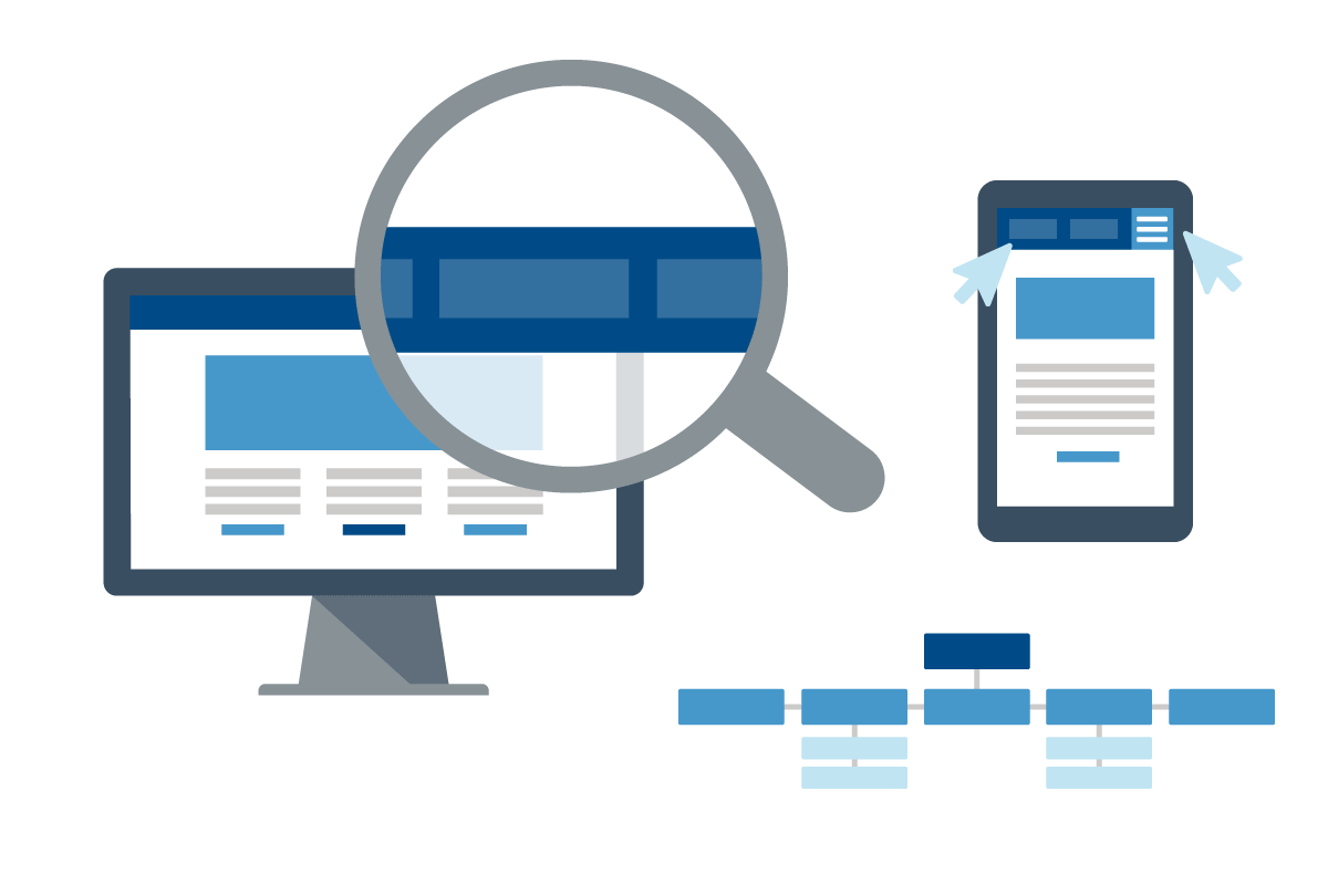
- Stick to convention. Your website navigation is not a place to get too creative—while you can experiment with fonts and colors, don’t put menus in an unusual place or have them function in a non-standard way. Your main navigation bar should appear horizontally across the top of the page, or, as a second choice, vertically along the left side, and its location and content should be consistent across all the pages of the website.
- Use descriptive terms for menus. When possible, be specific about what site visitors will find when they click on a menu item. Rather than generic terms like “Services” or “Products,” use labels that actually describe the services or products you offer.
- Limit menu items. You’d think that giving your site visitors more options would be a good thing, but actually, when it comes to the main navigation, too many menu items can make the site look cluttered and be overwhelming for users. Try to keep the number of main navigation items to 7 at the most, preferably 5 or fewer.
- For complex sites, use visual elements to make navigation easier. If your website is too large or complex to fit into a few menu items, there are several ways to organize a large amount of information while keeping navigation intuitive. If you have many products or services you want to include in a menu, consider using a megamenu, which expands to show more information when you hover over it (example: The Hole in the Wall Gang Camp). To easily display the contents of the main navigation items, you can use dropdown elements like DHTML, which shows the subpages of each main navigation element, or a curtain menu, which drops down across the entire top navigation to show all subpages. For sites with a complex structure, consider adding breadcrumbs—a secondary navigation type that shows the visitor where they are in the site (for example: Home goods > furniture > dining room > tables)—or color-coding different sections of the site.
- Put menu items in the right order. People are more likely to remember items at the beginning and end of a list, so put your most important menu items in the first and last positions on the top nav and menu items from your less-trafficked pages in the middle. Many websites place Contact and Login menu items in the far-right position for this reason.
- Consider using a sticky nav. If your webpages tend to be longer, requiring users to scroll down to see more content, consider using a “sticky nav bar” for your top navigation. A sticky nav, also called a fixed nav, will stay at the top of the screen rather than disappearing as you scroll down, so users won’t have to scroll back up to click menu items or see where they are on the site.
- Create a clear content hierarchy. Good user experience means giving site visitors clear signs to show how your site is organized. Think of a grocery store: how difficult would it be to find what you’re looking for if everything was stacked in a pile? You need clues to find what you need: a store directory, aisles with clear labels, and an organization that groups things logically. Follow that same process with your website by labeling the most important sections and organizing subpages within clear, relevant categories.
- Connect related content within your site. Just because two website pages are in different areas of your site doesn’t mean they have nothing in common. Help direct site visitors (and search engines) to related content on your site by cross-linking between pages that offer complementary content.
- Look for ways to guide your visitors. Sometimes, a site visitor won’t know exactly what they’re looking for or what they want to do on your site. Providing visual clues or other ways of guiding them toward desired actions is an excellent way to improve both user experience and conversions. On every page, offer links, calls to action, side menus, or suggested related content that gives visitors incentive to stay on your site and explore.