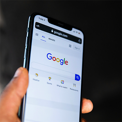
Mobile-Only Indexing is Here. Is Your Website Ready?

This month, Google is finally transitioning to mobile-only indexing after postponing the move from September 2020 to March 2021.
Google has been using mobile-first indexing for years, which means it has primarily been considering the mobile version of a website for indexing and ranking. Starting now, Google will only consider mobile sites—desktop versions will be dropped from the index altogether.
What does that mean for you? If your company has separate mobile and desktop websites, as far as Google is concerned, only your mobile site exists. Google will ignore any important images, content, or information that only appear on the desktop version.
Here’s what you need to do to ensure Google can see the full content of your mobile site:
- Check your robots meta tags: Make sure you use the same robots meta tags on the mobile version of your website as you do on the desktop version. Using noindex or nofollow tags on the mobile site may prevent Google from indexing or following links on your site.

- Be careful with lazy loading: Avoid using lazy loading (which only loads images once a user has performed an action such as swiping, clicking, or typing) for key content on your mobile site, since Google will not trigger those user interactions and won’t see content that requires a trigger action to load.
- Don’t disallow crawling: To ensure Google can crawl all the URLs on your mobile site, make sure you're not preventing them from being crawled with your robots.txt file.
- Match your desktop and mobile content: If your mobile site has less content (both page content and clear page headers) than your desktop site, either add that missing content to the mobile site or be aware that your site might lose some traffic and search rank as Google adjusts to having less information.
- Check your image quality: Make sure you aren’t using smaller, low-res images on your mobile site, because poor quality images might not be included in Google Images or receive favorable search placement. Check to be sure all images have quality alt text, and place images and videos in easy-to-find locations on your mobile site.
- Match up image URLs: If the images on your mobile site have different URLs than those on your mobile site, you might experience a temporary traffic loss as Google indexes the mobile versions. To avoid this, make sure the URLs for the images on your mobile site are the same as the ones on your desktop site, which Google likely already recognizes.
- Use schema markup for videos: If your site uses VideoObject structured data to describe the videos that live on the site, make sure the mobile version also includes the VideoObject schema along with the required additional information so Google will understand what the videos are about and be able to display them appropriately in searches.
In addition to these Google-specific considerations, you should also make sure you are providing a good experience for your mobile users, with a responsive layout, excellent website speed, mobile-optimized navigation, and easily clickable buttons and callouts.